こんにちは、「ウィリアム」です。クックパッドのAndroidエンジニアです。 私の日本語はまだ上手ではないので、これから英語で書きます!
Self-introduction (自己紹介)
Hi, my name is William, I'm an Android Engineer from the Cookpad's recipe team. I was originally in the global recipe team in Bristol, Uk, but I'm rehired to join the recipe team in Japan instead last year 2023. It is my first time ever in my life to write a techblog, please forgive me for the messy and unorganised structures, よろしくお願いします!
Statement
If you have been reading our techblog recently, you must be aware of what is currently going on with Cookpad! If you haven't, then I'll summarise it in a paragraph.
In the past, Cookpad recipe app operated separately in Japan, and rest of the world, Global. But now, we’ve merged into one, and we call it 'One experience.'
It was a long, challenging project, but also an exciting one! Looking back, what followed was the massive backlog of tasks created by the merger. There were so many things we wanted to accomplish, but we were often unable to due to time constraints, shifting priorities, or the limitations of the existing legacy architecture.
One day, if I still remember what it was all about, I’ll try to write about them. For now, I'll just write about something we face on a daily basis instead!
Recent Challenges We Faced in Android Development
Have you ever received a UI/UX requirement that isn't natively supported out of the box? One such requirement we received recently is:
Hide the ingredients section if there's not enough vertical space in the recipe card to prevent the cards in the list from expanding due to a long title or smaller screen sizes, which could result in an inconsistent UI.

Above is an existing Compose component that we have currently in Your Collection tab screen (also known as きろく tab screen when you switch to JP region in the app). We have a different version of this component depending on the recipe type but ultimately they all have the same content:
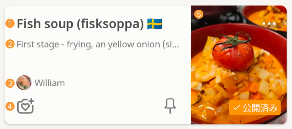
- Recipe title
- Recipe ingredient list
- Recipe author information
- Recipe actionable buttons
- Recipe image with「公開済み」label, this label appears when it is a published recipe belonging to the user.
The Problem
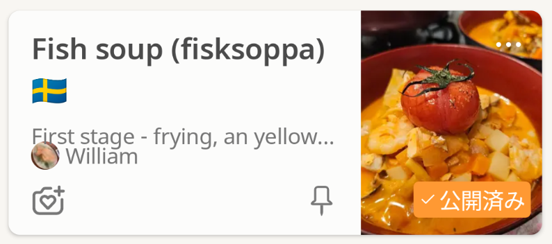
As you can see, the ingredient list section overlaps with the author information section when the recipe title spans two lines. This happens for a few reasons.
One of them is that the recipe image needs to be in a 3:4 aspect ratio; another is that the actionable buttons need to be positioned at the bottom of the card; and, additionally, the recipe height is now set to 160.dp.
So, there’s a Modifier.weight(1f) and a Modifier.height(160.dp) applied somewhere...
This will be more likely to happen when the user enlarges their device's default font size or screen size, which will cause the ingredient list (2) to overlap with other components if there isn’t enough space for it.
How to fix it
Now we need to make the ingredient list (2) disappear if there isn’t enough space for it, let's dissect the component!
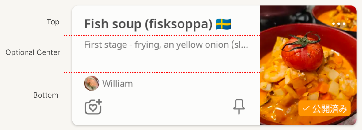
From the figure above, we identify the three components of the recipe card: the top, bottom, and optional center (ignoring the recipe image).
Logically, after the top and bottom are drawn, we need to calculate the remaining vertical space and then determine the required height to display the ingredient list.
After researching it for a while, it was actually easier than I originally thought. It's quite straight forward after going through Android documentation here developer.android.com
It's time for the classic hello world testing
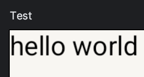
I decided to try using the Layout Compose component to solve the problem above. Below is the composable preview of hello world test I used to experiment with the composable.
Layout(
    modifier = modifier,
    content = {
        Text("hello world")
    },
) { measurables, constraints ->
    val placables = measurables.map { it.measure(constraints) }
    val text = placables[0]

    layout(width = constraints.maxWidth, height = constraints.maxHeight) {
        text.placeRelative(0, 0)
    }
}
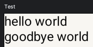
val placables is a list of components that need to be placed in the layout, determined by what we pass into the content parameter above. Another example will be:
Layout(
    modifier = modifier,
    content = {
        Text("hello world")
        Text("goodbye world")
    },
) { measurables, constraints ->
    val placables = measurables.map { it.measure(constraints) }
    val helloworld = placables[0]
    val goodbyeworld = placables[1]

    layout(width = constraints.maxWidth, height = constraints.maxHeight) {
        helloworld.placeRelative(0, 0)
        goodbyeworld.placeRelative(0, helloworld.height)
    }
}
Now, val placables is a list containing the Text("hello world") node and the Text("goodbye world") node.
When using .placeRelative(x, y) to position the node in the layout, the coordinates are relative to the current layout's (0, 0) point, which starts at the top-start corner on LTR devices and the top-end corner on RTL devices.
Alternatively, you can use .place(x, y) to position the node, but note that .place(x, y) ignores the RTL context, so it will always position the node relative to the top-left corner, regardless of whether the configuration is RTL or not.
Implementation
So, after familiarising ourselves with Layout, we can now start implementing the custom composable. Since we identified that there are three parts in the composable, we call them top, center, and bottom:
Layout(
    modifier = modifier,
    content = {
        Column {
            top() // The top part will consist of the recipe title.
        }

        Column {
            center() The center will contain the ingredient list.
        }

        Column {
            bottom() // The bottom part will include the author information and the actionable buttons.
        }
    },
) { measurables, constraints -> {
   ...
}
I wrapped them in Column as it's a column design and I can define the custom view composable parameter as ColumnScope.() -> Unit.
The next step is to place them in the layout
Layout(
    modifier = modifier,
    content = {...},
) { measurables, constraints -> {
    val placables = measurables.map { it.measure(constraints) }
    val topPlacable = placables[0]
    val centerPlacable = placables[1]
    val bottomPlacable = placables[2]

    layout(width = constraints.maxWidth, height = constraints.maxHeight) {
        topPlacable.place(0, 0)
        bottomPlacable.place(0, constraints.maxHeight - bottomPlacable.height)
    }
}
The code above will position the top component at the top-start and the bottom component at the bottom-start. Once the top and bottom components are in place, we will need to measure the available vertical space to determine if there is enough room to place the center component, which is the ingredient list.
Layout(
    modifier = modifier,
    content = {...},
) { measurables, constraints -> {
    val placables = measurables.map { it.measure(constraints) }
    val topPlacable = placables[0]
    val centerPlacable = placables[1]
    val bottomPlacable = placables[2]

    layout(width = constraints.maxWidth, height = constraints.maxHeight) {
        topPlacable.place(0, 0)
        bottomPlacable.place(0, constraints.maxHeight - bottomPlacable.height)

        val availableVerticalHeight = constraints.maxHeight - topPlacable.measuredHeight - bottomPlacable.measuredHeight
        if (centerPlacable.measuredHeight <= availableVerticalHeight) {
            centerPlacable.place(0, topPlacable.measuredHeight)
        }
    }
}
The steps to calculate the available height are as follows:
- First, we get the maximum height of the parent layout.
- Using the parent layout's height, we subtract the measured height of the top component and the measured height of the bottom component.
- With the remaining vertical height, we compare it to the center component's measured height and determine if there's enough space for it.
- If there is enough space for the center component, we place it below the top component. Otherwise, we do nothing.
With that in place, we can now use it in the recipe card composable and check if it works! The results are as follows as we tweak the device's font size and screen size:

Yay! It works, and now it's in production! It seems to be fine, as there haven't been any crash logs related to it, so that's good news... so far.
Below is the actual display of the custom view in my device after changing the default system font size from x1.0 to x1.3.
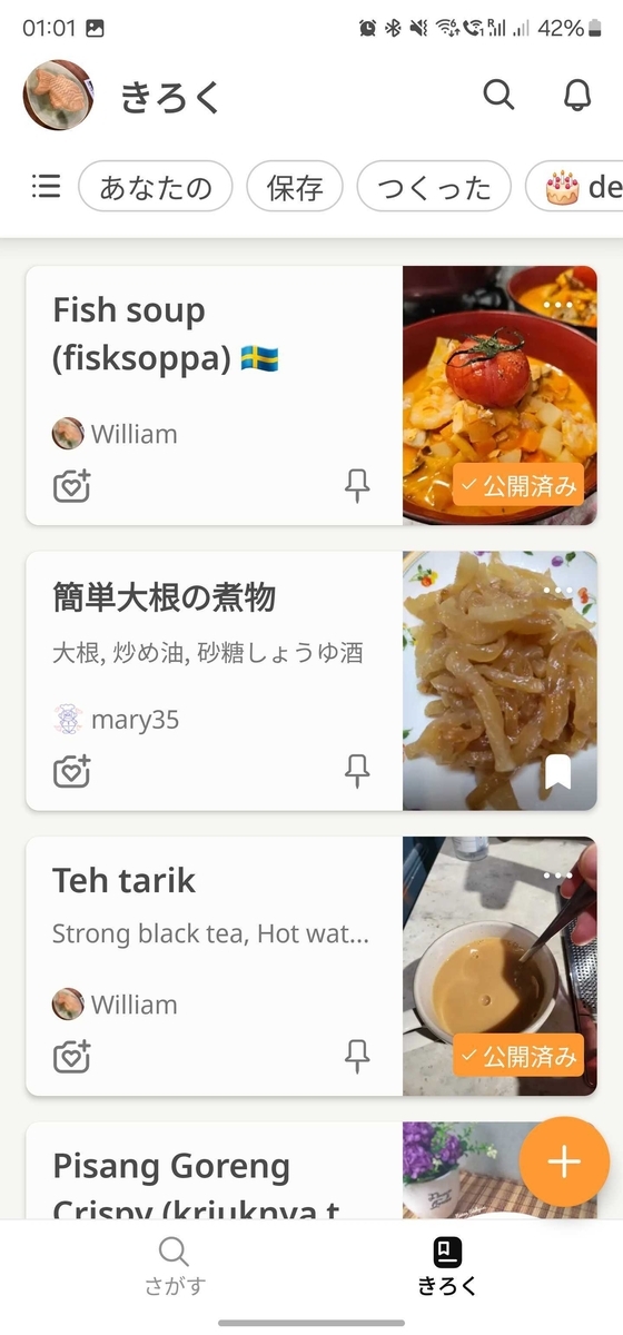
If the top component or the bottom component takes up more vertical space than is available, they will overlap. However, this depends on the specific feature using the layout. In our current use case, this is acceptable, since the top component is simply a recipe title with a maximum of two lines, and the bottom component is just author information (with a maximum of one line) and actionable buttons with fixed sizes. Therefore, we don't need to handle this edge case at this time, according to the YAGNI (You Aren't Gonna Need It) principle.
The final code
@Composable
fun ResponsiveColumn(
    top: @Composable ColumnScope.() -> Unit,
    center: @Composable ColumnScope.() -> Unit,
    modifier: Modifier = Modifier,
    bottom: @Composable ColumnScope.() -> Unit
) {
    Layout(
        modifier = modifier,
        content = {
            Column {
                top()
            }

            Column {
                center()
            }

            Column {
                bottom()
            }
        },
    ) { measurables, constraints ->
        val placables = measurables.map { it.measure(constraints) }
        val topPlacable = placables[0]
        val centerPlacable = placables[1]
        val bottomPlacable = placables[2]

        layout(width = constraints.maxWidth, height = constraints.maxHeight) {
            topPlacable.placeRelative(0, 0)
            bottomPlacable.place(0, constraints.maxHeight - bottomPlacable.height)

            val availableVerticalHeight = constraints.maxHeight - topPlacable.measuredHeight - bottomPlacable.measuredHeight
            if (centerPlacable.measuredHeight <= availableVerticalHeight) {
                centerPlacable.placeRelative(0, topPlacable.measuredHeight)
            }
        }
    }
}
Closing statement
Building your custom Composable layout is actually quite straightforward and fun, although I deliberately left out some explanation in the post such as the layout's measurables and constraints.. please do read the Android documentation for their explanation! You can also check out in the code too if you prefers that.
There's also another use case for a similar technique inside Modifier.layout {} when implementing a horizontally-scrolling, full-width carousel in a lazy grid layout with content padding. This ensures that the carousel can scroll past the content padding. I’ll write about that in the future if I have the opportunity to do so.
If you're interested in the recipe I used in this post, feel free to take a look at the link provided below! Although it’s in English, it’s quite simple and straightforward. It took me a lot of trial and error to get the taste as close as possible to the one I had in Sweden when I was working there.
* Clicking the link should open your Cookpad app if it's installed, it should work even regardless of which Play Store / App Store you installed it from ^^
I hope to improve my writing and provide more interesting use cases in the future. Thank you very much for reading!