Hello there, it's Dave Fox! I'm an iOS engineer from the Creation Development department in Cookpad. (@wowitzdave)
In this post, I'm going to talk a bit about how I used custom internal tooling and prototyping tools to help Cookpad's design and development workflow.
I'll look at how product and engineering teams can interact with each other more efficiently and ways in which we, as engineers, can empower designers to make their visions become a reality more easily.
Introduction
Last year, I began work on the internal Cookpad iOS renewal project. As part of its development, I was responsible for creating a new UI component to display user images in a style known as the Ken Burns effect.
The effect consists of panning and zooming around images and cross-fading between each one to give a sense of depth and dynamism.
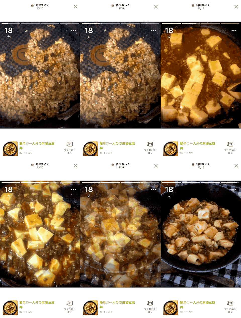
Here's a short look at it in the iOS Cookpad app today...
Technical Implementation
Looking at the above effect, it doesn't seem too complex to implement... Just display some images with a zoom or a pan and fade between them. However, there are many settings and attributes applied to each image's animations and also to the slideshow's root animation as a whole. Each and every one of these values needs to be carefully considered to create the right "feel". Let's take a look at the parameters our animation requires:
For The Overall Slideshow
- How long (in seconds) should we show each image?
- How long (in seconds) should the duration of the cross fade be?
Additionally, each image uses either a zoom or a panning animation. These styles also have individual settings...
For Panning Images
- From which anchor points should the animation start from and end at?
- What speed should the animation happen at?
For Zooming Images
- At which anchor point in the image should we zoom from?
- What scale should we zoom from and to?
- What speed should the animation happen at?
In order to create the exact effect the product team wants, these are all parameters the designers want to be able to define.
In a feature like this, it is often difficult for designers to imagine exactly what values they want. Often, design and development will work on a "trial and error" basis, tweaking values back and forth. With this many settings though, it would take a lot of time from two people to achieve the final goal. The workflow may look something like this:
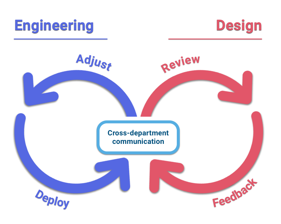
The issue with this flow is the "Cross-department communication" bottleneck. Because of rapid iteration, this happens frequently and takes the time of both engineering and design teams to communicate changes. Each iteration takes a lot of time and disturbs the working pattern of all members involved on a feature.
A Product-Centric and Tools-Driven Approach
I had a lot of other tasks to work on as part of the renewal project but I knew the product team would want to iterate on this feature a lot so I decided I wanted to create a workflow which could reduce friction between design and engineering, keep both sides as productive as possible and, at the same time, create a toolset that is easy to use and familiar to designers. This was important to enable design to be as creative as possible.
Giving Designers Greater Control
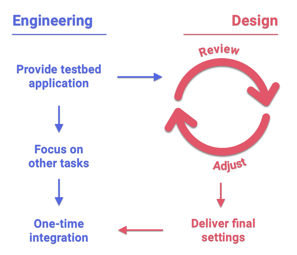
To achieve this workflow, I decided to make a testbed application that would allow the design team to reiterate and play with all these animation values.
Then, when they were satisfied with the final animation. I could simply take their finalised values and copy them into the main iOS app codebase.
This would make the following workflow possible:
Testbed Application Implementation
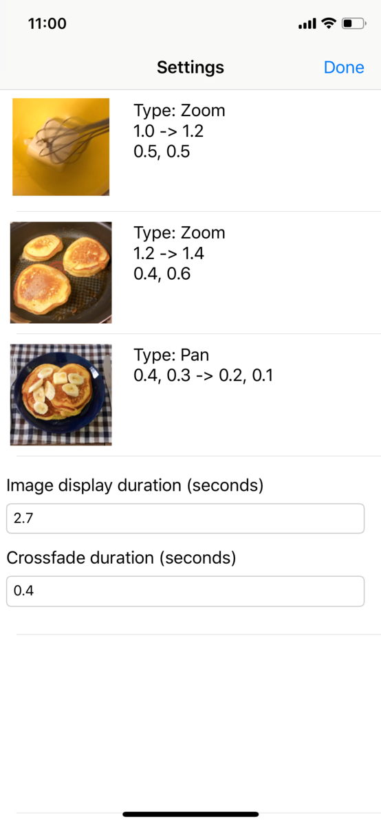
So, I started off with a basic implementation of the Ken Burns effect with some default values and then created a simple application with screens to alter the animation settings and view a live preview of how the animation would look in the final product.
Let’s take a look at what this app ended up looking like:
| Overall Settings | Zoom Settings | Pan Settings |
|---|---|---|
 Overall animation settings Overall animation settings | 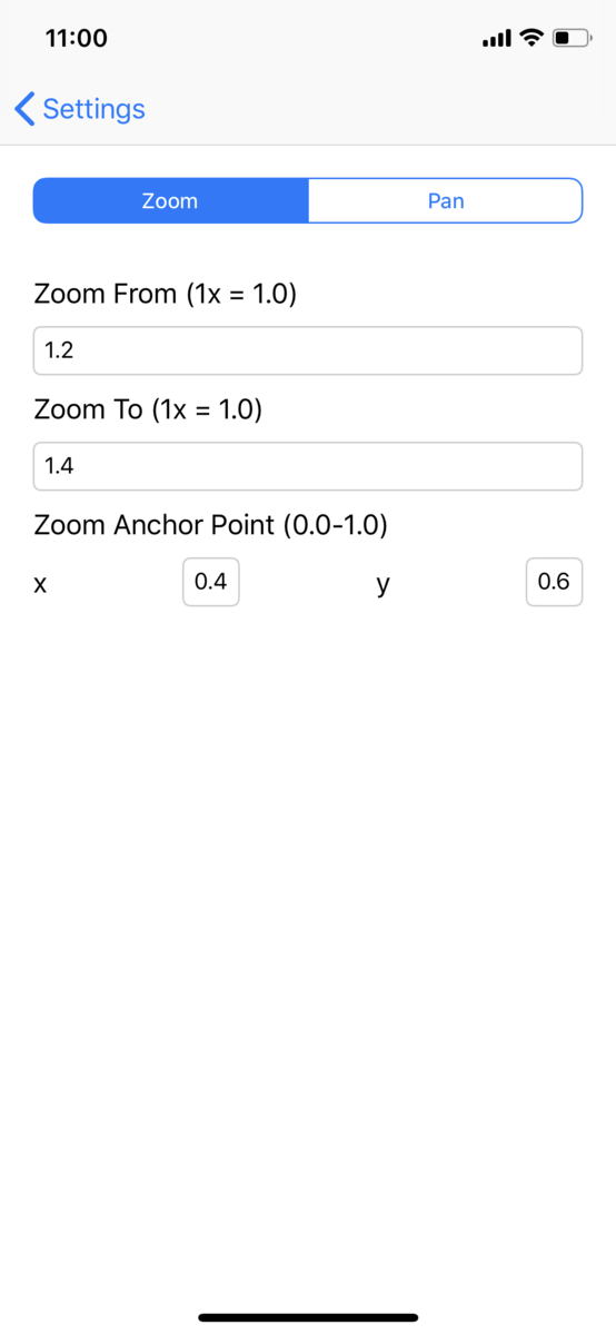 Zoom scale and anchor point settings Zoom scale and anchor point settings | 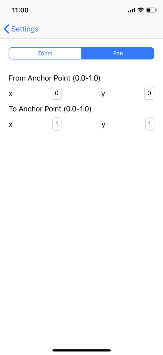 Pan from and to anchor point settings Pan from and to anchor point settings |
As the design team modifies the animation values, they can preview their settings at any time on the home screen. This screen shows the animation in a number of different sizes and aspect ratios so the designers can see how things will look in a variety of different contexts within the Cookpad iOS application:

The designers can quickly and easily play with these values and, once happy, I have one sit-down meeting with them and integrate their final values into the application.
Results
When I think of the merits of this kind of approach to feature development, I look at two main areas:
- Engineering time and effort
- Friction between the wants of designers and the final output of engineering.
Time Taken
The design team made many many iterations of these values within the testbed application but because they could iterate in isolation, I didn’t need to spend any of my time on each change. With the "one time integration" approach, bringing the product team's vision into the main app only took me about 15 minutes of my time.
To this end, the amount of time taken from creating the prototype application and finalising the settings within the app was quite short so I think it was definitely worth it to take this approach.
Interaction With Designers
I had good feedback from the design department. Designers work visually and want to tweak settings and values on-the-fly. Giving them a visual interface to perfect this feature is more in tune with how those departments work so I think they found this approach more natural and efficient. It also allowed them to use their creativity to the fullest as there was no engineering bottleneck in the way.
Thanks for Reading!
Have you used tooling like this before? Was it helpful and how did it help you integrate with your design and product teams?
I believe that engineers shouldn't just code. They should also engage in the product development lifecycle. I think that understanding what product teams want and helping them realise their visions makes us better engineers and helps us grow as contributors across the entirety of a project, not just its codebase.
To that end, custom tooling like this can help bring us closer to the product team and helps them realise their visions more easily, often resulting in better, more cohesive products.
Thanks again for checking this post out. I hope it helps you and your team make better products going forward...